
FRESH &
FABULOUS
A Q&A with Designer
Lisa McDennon
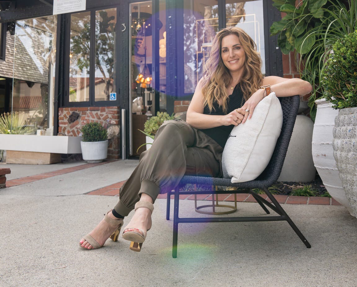
We sat down with Lisa McDennon, the master of fresh, organic elegance, to talk about her new Hinkley collection and what inspires her to create designs brimming with pure sophistication. She gave us an inside peek into her designer profile, highlighting tips and tricks to create a lighting plan that’s impressive and functional.
TELL US ABOUT SOME OF YOUR NEW RELEASES
In January, we released Ophelia in a Natural finish, and now we are adding an all- black finish, which is really exciting! I think those two colorways are so interesting and fun. This design evolved from Luca and the exploration of natural materials, and I see Ophelia as the younger offspring of Luca. Ophelia is a bit more delicate, a tad more feminine, and incorporates a bold geometric herringbone pattern featured in the weave of the shade. I frequently specify herringbone tile patterns in my interior design projects, as I absolutely love it! Naturally, I wanted to incorporate it into Ophelia’s design and honor the creativity and art of basket making and weaving, where the pattern is derived from. (Interestingly, the herringbone pattern was first used in ancient Greek & Roman times as a paving pattern for roads and has been used for centuries all over the world – most commonly seen in Egypt, France, England, & Morocco.) The pretty geometric edge detail highlights the design and pairs nicely with the functionality of the fixture.
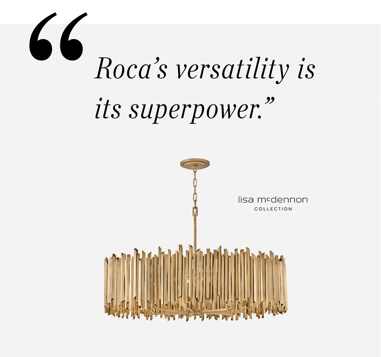
Roca is a dramatic piece, particularly because of its oversized diameter and lower profile. Larger fixtures are trending right now, but the importance of this fixture is that its shade is only 9” tall! The largest diameter is 40”, making it a perfect choice for a room with lower ceilings. So often, as designers, we are looking for a fixture that can command a large space but still work for a lower ceiling. I see Roca being used in a dining room or large primary bedroom. I also love the idea of using two or three fixtures clustered together to create a sculptural vertical effect in an entryway or stairwell. Roca’s versatility is its superpower.
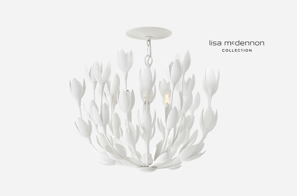
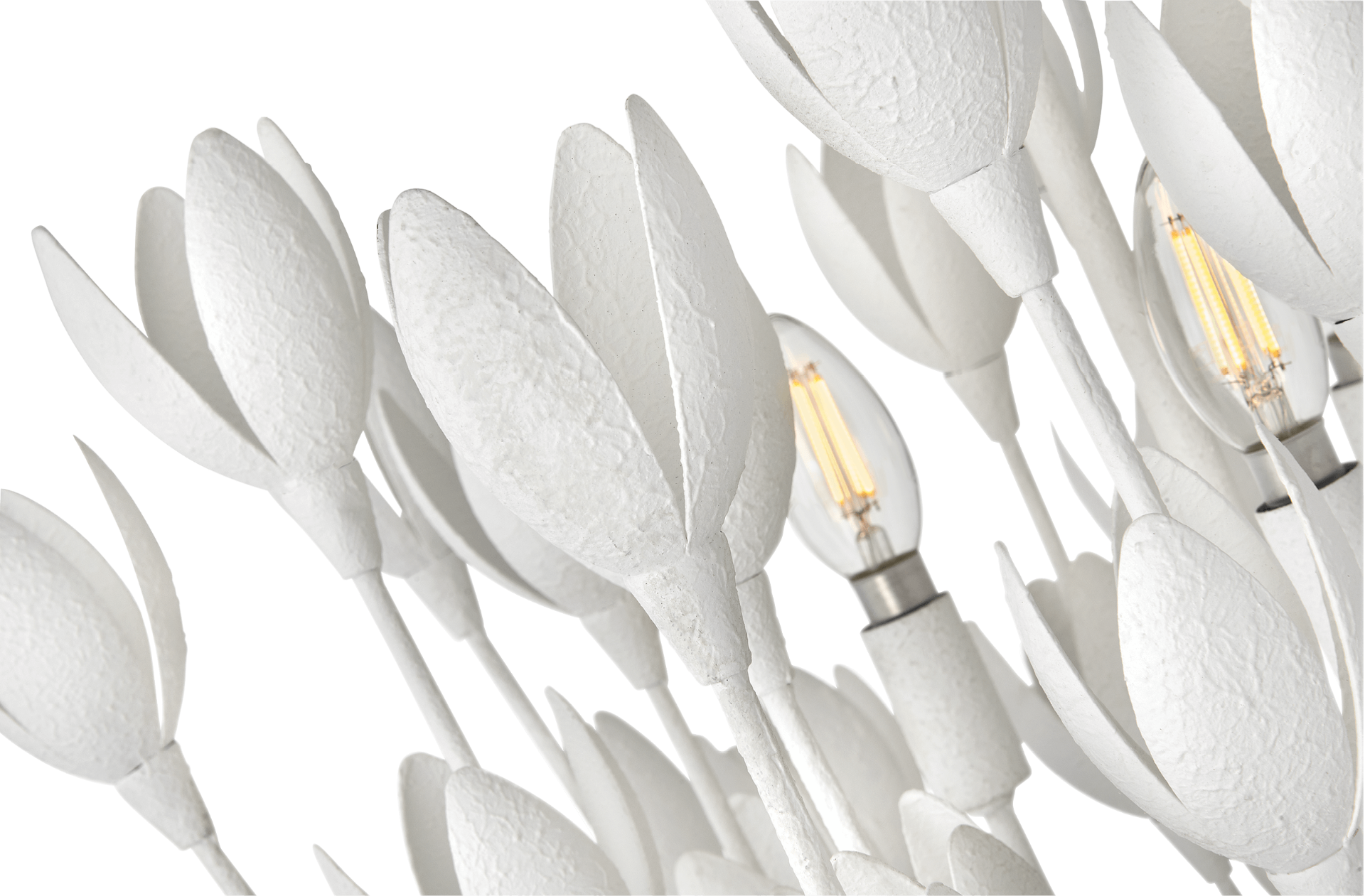
We had such a great initial reaction to the Flora chandelier that I immediately thought, “what other designs can I create for this beauty?” There was a lot of anticipation about what was coming, and I knew right away we needed a smaller, semi-flush convertible. I’m so excited we have expanded the collection to include this smaller fixture, which is perfect for powder rooms, nurseries, and smaller spaces. We also released the linear version, which is 60” long - an obvious choice for larger dining rooms and perfect to install over rectangular tables.
CAN YOU TELL US MORE ABOUT YOUR INSPIRATION FOR FLORA?
I crave organic lighting, and I’m always hunting and searching for inspiration that’s a little outside the box. I gravitate towards things that feel natural, that resonate with nature. And, I admit, I also like pretty things. Flowers are simply so beautiful! They are my indulgence, and on my weekend trips to the market, I usually splurge and buy flowers for myself. I like having greenery around me, both in my home and in my office. I know it can be a bit of an indulgence to buy yourself flowers once a week, but I think of it as self-care. I don’t wait for my husband to buy them for me. I buy them myself because they make me feel good, and they’re pretty. I put that inspiration into Flora; it’s like having a permanent, beautiful bouquet of flowers in your house that will never fade or wither.

HOW HAS USING LED CHANGED THE WAY YOU APPROACH LIGHTING DESIGN?
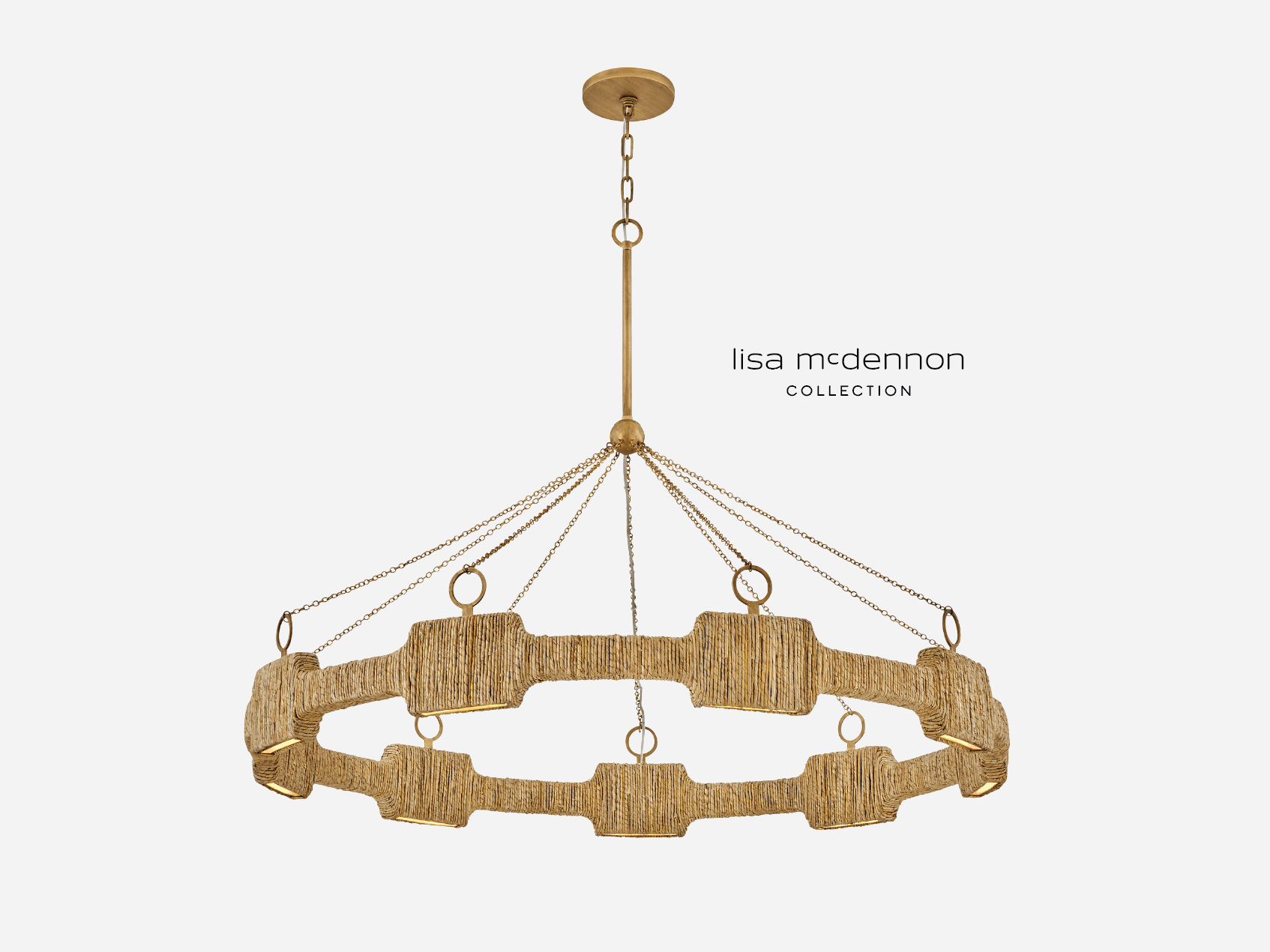

I am super excited about LED technology, and I think Raffi is a great example of incorporating LED into lighting design because, without it, Raffi would not exist. Integrated LED is opening up so many possibilities, creating a whole new category of design and innovation, and the possibilities are endless. I am passionate about the ability to have more flexibility with silhouettes and color temperature. I also glow of the light, but I don’t want to see the bulbs – integrated LED makes that possible in an entirely new way.
WHAT DOES "GOOD DESIGN" MEAN TO YOU?
I’d say it means multiple things to me. I always say that a timeless design is a good design. What that means to me is that you’re not constantly on the trend train. I like to play with the trends, but I don’t want to be buried in them. If you have a consistent thread of strong, classic design, you can dabble with accents to keep things fresh and fun. If you’re considering a contemporary project or creating a very modern aesthetic, that is the time for a designer to push the boundaries and not get stuck in a safe space. It’s a great opportunity to be a little bit more bold, daring, or edgy and do something different – something unexpected. Once you have an underlying foundation of a timeless design, you can throw in a twist that offers an element of wow and surprise. It could be an interesting piece of furniture, a different shape, a pop of color. So, for me, good design is not getting carried away with the trends but utilizing them thoughtfully, the way you would with jewelry.
If we stripped away the style, I think the one consistent thread with good design is the detail. And it doesn’t matter if you know what style you’re doing or what product you’re working on - if you don’t have the details right, the design falls apart. You can have the best idea, but if it’s not executed well, and if you haven’t taken the time to engineer the details properly or look at the scale or the quality of the manufacturing, then it’s not going to be a pleasing design.
WHAT TRENDS DO YOU THINK WILL BE BIG THIS YEAR?
As of right now, curves are just exploding. I think everybody is kind of boomeranging back from all the hard, clean edges that we’ve had for the last couple of decades. And the 80s are in full swing. For those of us who’ve lived through the 80s, it’s a little surreal. We might be questioning if we really want to embrace this, but for the younger people who didn’t experience it, it’s so hip and so cool.
Additionally, brass and burnished metals are still so hot. White finishes have been bubbling in the background for a while, and it’s exciting to see more products coming out in white; it will be a strong trend moving forward. I’m also seeing lots of texture and natural materials, which I am always drawn to, so I’m very thrilled about that
DO YOU HAVE ANY ADVICE FOR SOMEONE SHOPPING FOR LIGHTING FOR THEIR HOME?
Yes – go view your lighting selections in person! This is so important. You should go shopping and see the scale because it is not always something that is easy to visualize without seeing it in real life. It should be an integral part of the design and decision-making process to see, touch, and feel before buying.
HOW DOES LIGHTING TIE TOGETHER THE DESIGN OF THE ROOM?
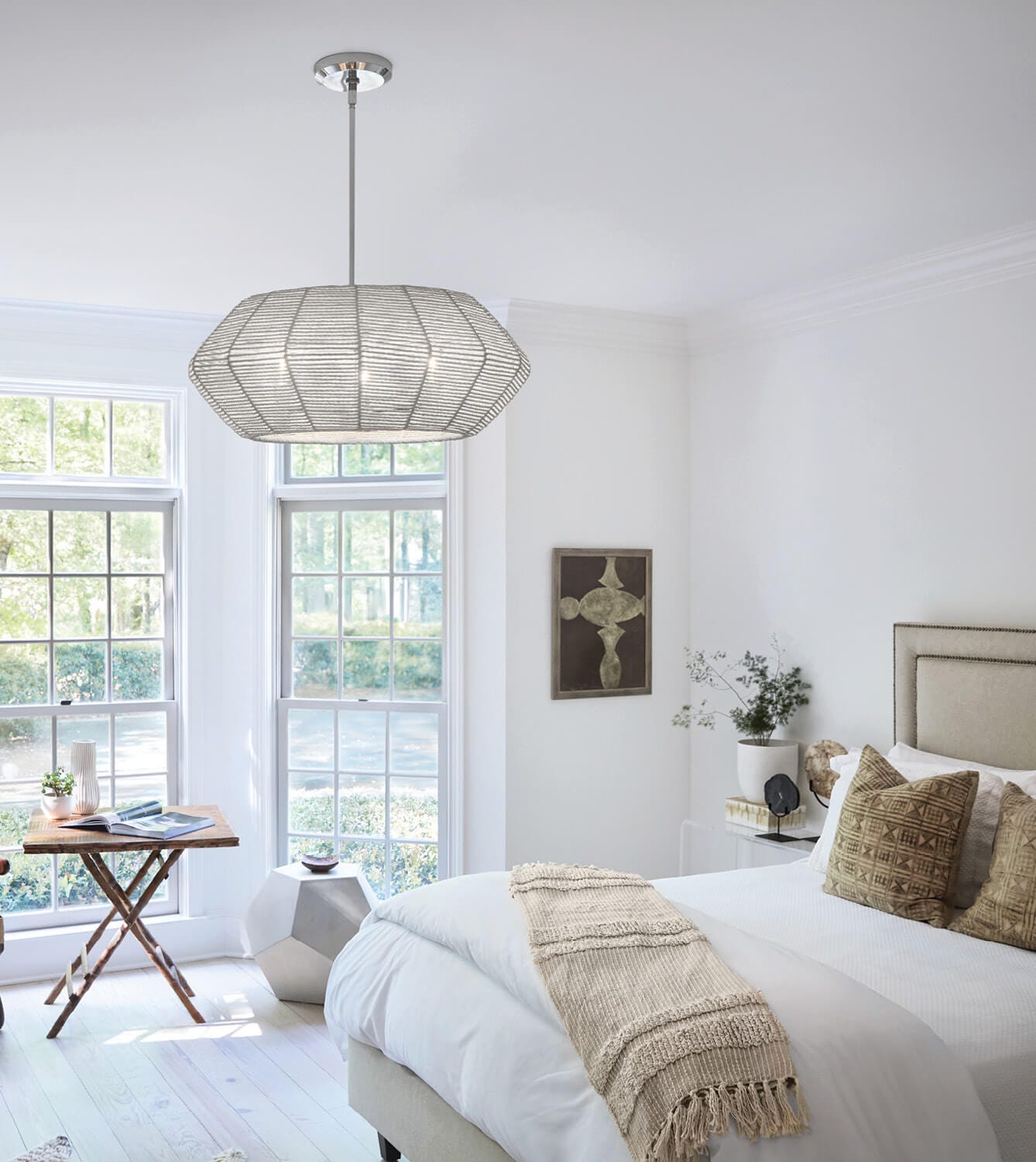

I believe lighting is the one element in design that can provide both the foundation and the finishing touches of a room. Lighting provides elements of pattern, texture, reflection, and beauty that truly creates the flair and magic within a space. The tonality of light can envelop a room and provide the essential mood factor for an interior that no other design element is capable of doing. It can provide a subtle repeat of pattern and color, as well as add a needed sparkle or drama to elevate the overall design. Layering is important in creating this cohesive effect, and it’s essential to combine task, ambient, and accent lighting to draw the space together and provide the mood and aesthetic you desire. scale. This simple trick helps you to see it in 3 dimensions and allows you to better understand the volume of space the fixture will occupy.
WHAT WOULD YOU SAY IS THE MOST COMMON LIGHTING MISTAKE PEOPLE MAKE?
I think the most common mistake one can make with lighting selections is scale. I think it is so easy to make this mistake, whether the fixture is too big or too small or just not hung at the right height – that can ruin what would otherwise be a beautiful design.
WHAT ROLE DOES LIGHTING PLAY IN YOUR INTERIOR DESIGN WORK?
It’s one of the most critical design elements. Lighting can make or break a project. You could have the most beautiful interior, but if you have not thought in detail about the lighting design, it will fall flat. I think a well-planned lighting design and the execution of that plan can transform a not-so-great interior into something fabulous. And if you start with a great interior, gorgeous and functional lighting will complement and enhance the beauty and enjoyment of those spaces. If you’ve lit it up well, it’s going to be A+ phenomenal!
The Lisa McDennon Collection, introduced in 2018, has created some of the most sought-after designs in the Hinkley portfolio. Her unique vision and striking signature style come together to create lighting designs that are sophisticated, unexpected, and timeless. Click below to explore the full collection.
