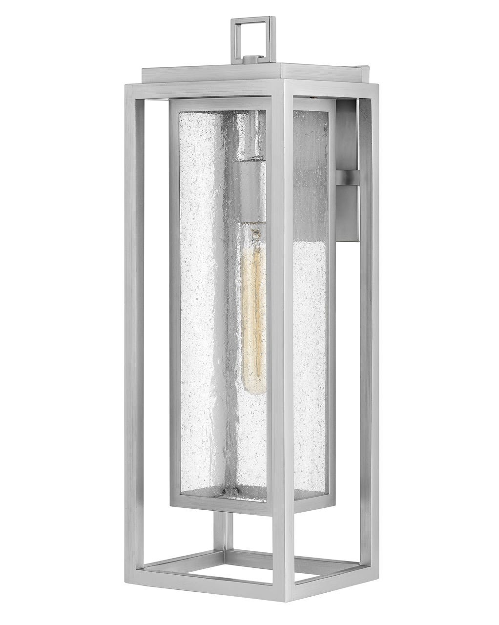
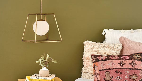
Three Hinkley regulars tell us how they design with kiddos in mind
One of our favorite parts of what makes us who we are is the ability to connect with creative, talented individuals who love the Hinkley brand. With fresh, personal tastes, they help us understand where their style and inspiration derives from – and often times, how lighting plays an integral role in that. We had the chance to interview three unique Hinkley shoppers who gave us a deeper look into what they do and how they do it.
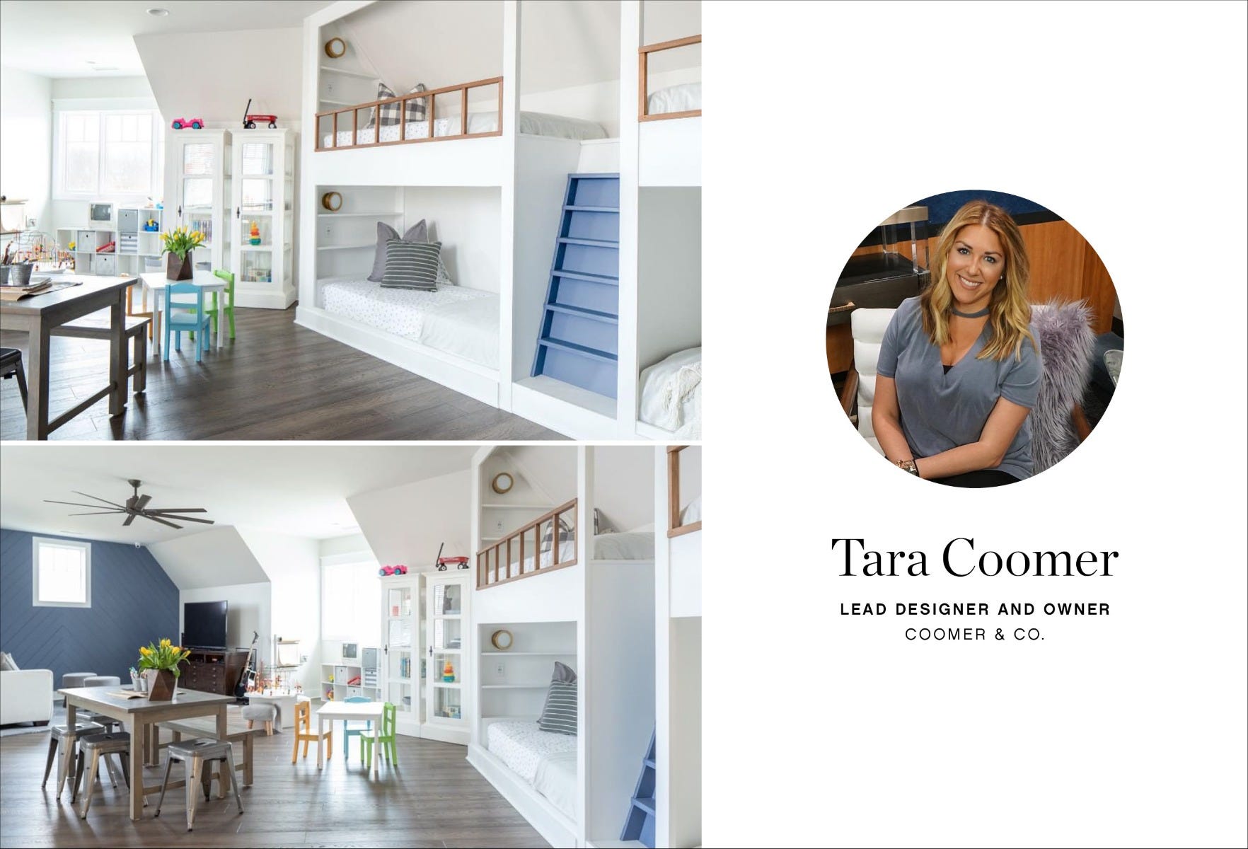
Can you tell us a little bit about Coomer and Co. i.e. how you got started, your team members and your design firm in general?
Coomer & Co. was started in 2012. After I graduated from college, my husband traveled with the Army so I took it upon myself to start my own business. At first it was just myself, and I began to get so busy I needed the help. Now it’s me and my assistant designer, Meaghan. We do both commercial and residential space, but definitely specialize in residential. We love how personal residential is and we love working with our homeowners to do specialized spaces just for them!
We are obsessed with the practicality and function of this space! Can you tell us about your creative thinking behind this bunk/playroom combo?
The homeowners are blessed with 6+ grandchildren and wanted a space they could feel at home in and not be afraid to have fun and be creative. The bunks make for a practical yet whimsical sleeping situation. We added a fun pop of color on a trim/accent wall to give it another pop of personality.
When you started this project, what was a main priority for the homeowner?
The homeowner wanted a bunk area from the beginning. It was important for them to have a purposeful space for their grandchildren.
What drew you to use Mercer for this space?
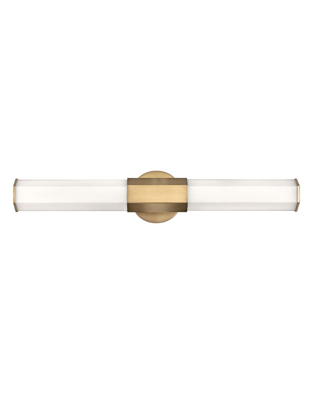
The Mercer sconce was the perfect addition to the bunk area. We loved that it was playful yet chic, therefore still a continuation of the more formal spaces in the house. It was both the perfect size and look to tuck right in with the bunks. The gold tone of it helped warm up the light-colored walls and also add an almost fun, nautical feel that every kiddo loves.
Check out @coomerandco on Instagram and see more of their projects on coomerco.com; shop Mercer here
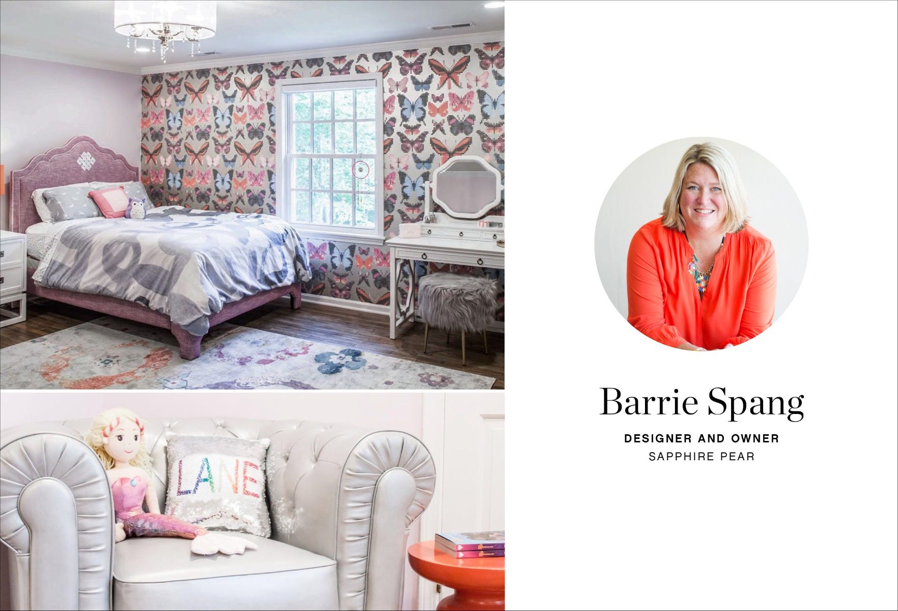
Hinkley is very familiar with Sapphire Pear as we’ve worked on many projects together. For those who aren’t familiar, can you tell us a little bit about your team and your design firm in general?
We have an amazing team of four at Sapphire Pear and each of us play an integral part of the project process for our clients. We like to use color in our design, and it is important to us that our client’s homes or spaces reflect them or their company. We do like to have fun in the process and love to throw a good party.
You've designed several children’s rooms – do you approach these designs differently?
Surprisingly I don’t approach kid’s rooms any differently than any other room, but I do know typically the client will let me have a little more fun and get more creative. I design children’s rooms for them to grow up in and make sure they won’t date quickly, so I avoid any characters or themes.
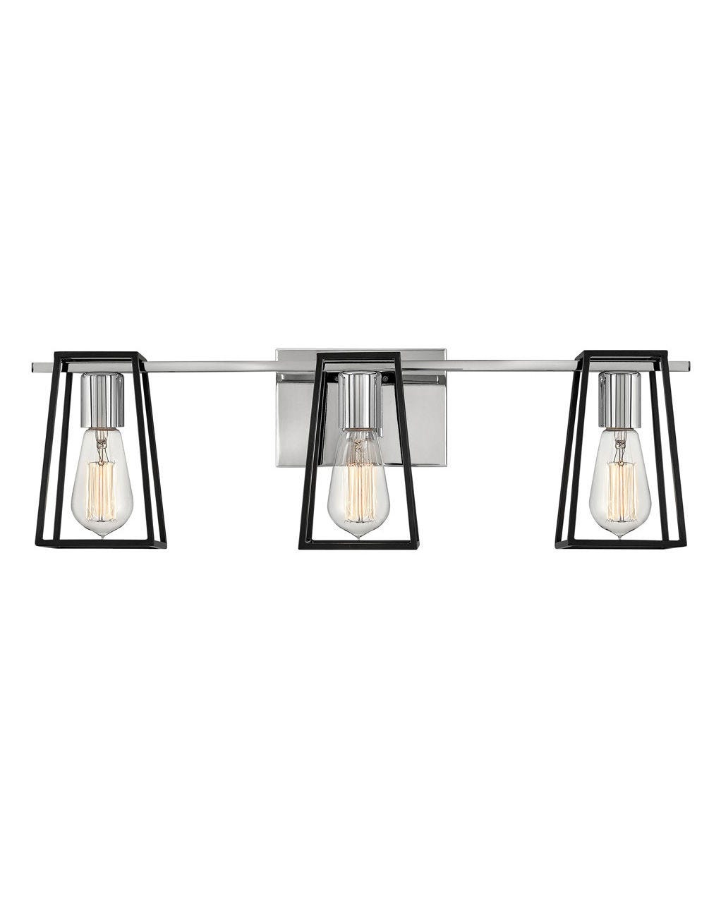
Check out @sapphirepear on Instagram and see more of their projects on interiordesignrockyriveroh.com; shop Carlton here
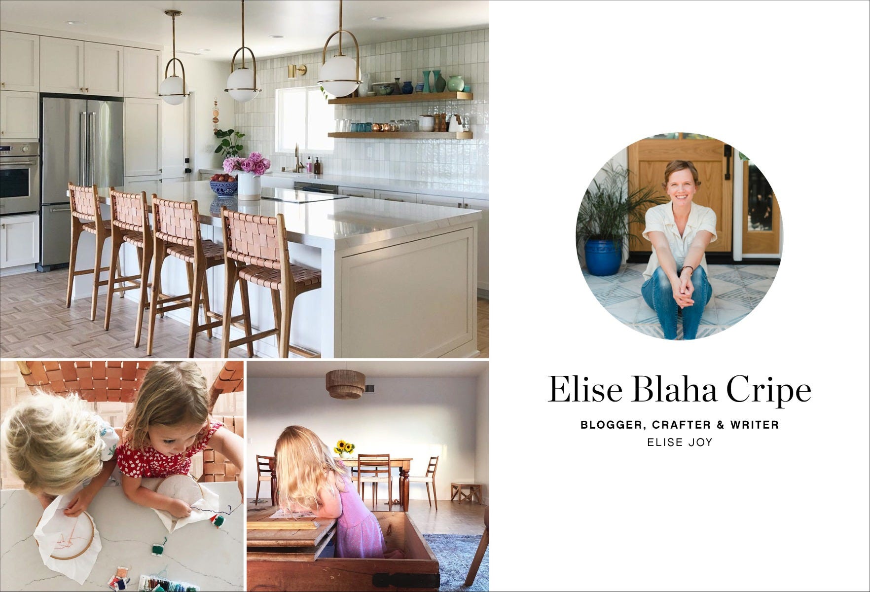
Can you tell us about your journey in becoming an expert DIY-er and master-crafter?
My parents were always big on DIY house projects when I was growing up so I feel like I followed their lead and just believed that trying to do something yourself was worth it. I started a blog (enjoyitblog.com) in 2005 and was always looking for new craft projects and DIYs to share. We also moved a lot the first few years of our marriage (my husband is in the Navy) and so it felt like every eighteen months I had a new place to decorate.
We followed the remodel of your new home and noticed you really paid attention to the details; what was your process in designing each space?
Thank you! I am happy with how the house is coming together. My process was to come up with a color scheme early. I knew that I wanted the whole house to be light and bright and so I went with mostly white and cream for the big items (walls, tile and cabinets). Then I decided to use brass finishes so that narrowed my lighting and faucet choices (I find having less options is much better than more options). I chose to warm up the spaces with wood and tan furniture and add a pop of blue through rugs, pillows and the bathroom tile.
What drew you to Somerset for this space?
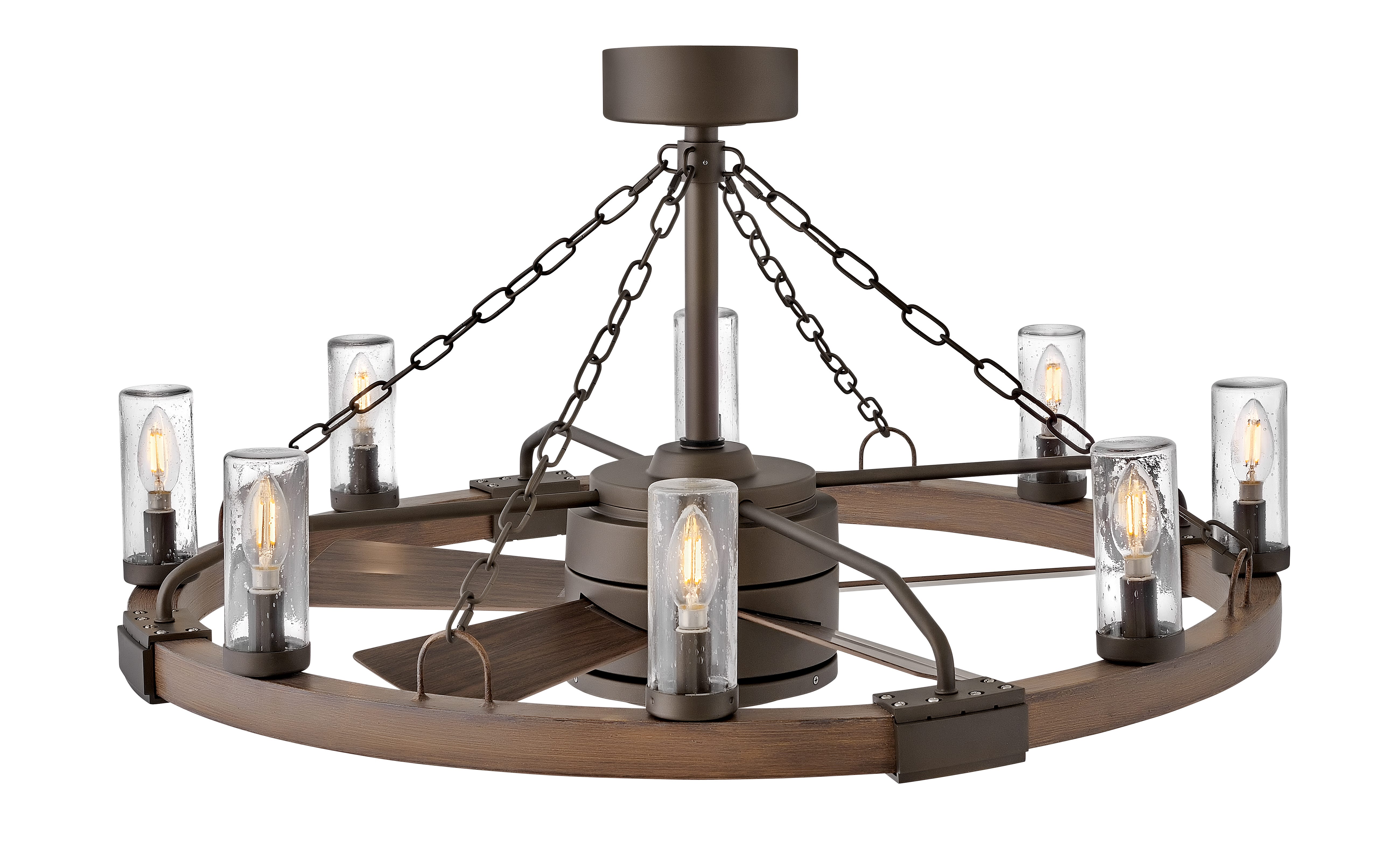
I stumbled on the lights while searching “brass” and knew right away they would be perfect. I wanted something simple that made a statement and I couldn’t be happier with the pendants.
We love how you capture so many day-to-day activities in your feed with your family. When creating this space, was everyday practicality for your two daughters a main driver in the design?
Yes, definitely. My girls are 3 and 6 but we plan to live in this house for a very long time, so I was thinking about what would work now AND what would work ten years from now when they are in high school. We wanted a ton of seating at the island for coloring and helping with baking cookies now, and for homework and early morning breakfast in the future. My biggest tip for making a space work for kids is hidden storage for toys, art supplies and the piles of stuff that kids like to travel with. This might be extra cabinets or baskets. For us right now, this is a vintage coffee table that opens up. Ours is packed with art supplies!
Check out @elisejoy on Instagram and see more of her projects on elisejoy.com; shop Somerset here
